- eComm strategy
- Media strategy
- CRO
- Social media advertising
- UX + UI design
- Data analysis
- Performance reporting
- Video
- Photography
- CRO
- UX + UI design
- Performance dashboard
Cannuka is a beauty and skincare brand with a clear USP; it combines CBD and Mannuka Honey into products that are naturally better for your skin.
Cannuka started working with Ten Four in early 2020 in order to leverage the agency’s expertise against a market that is still in the teething stages of widespread social acceptance.
What started as a small project has evolved into an ongoing campaign to push this USA brand forward by refreshing their website, brand and art direction and managing their social spend.
Cannuka was a breath of fresh air, as they had already established a refined and elegant brand. Nevertheless some tweaking was needed to optimise for the market as their brand application, while beautiful, fell short in terms of performance.
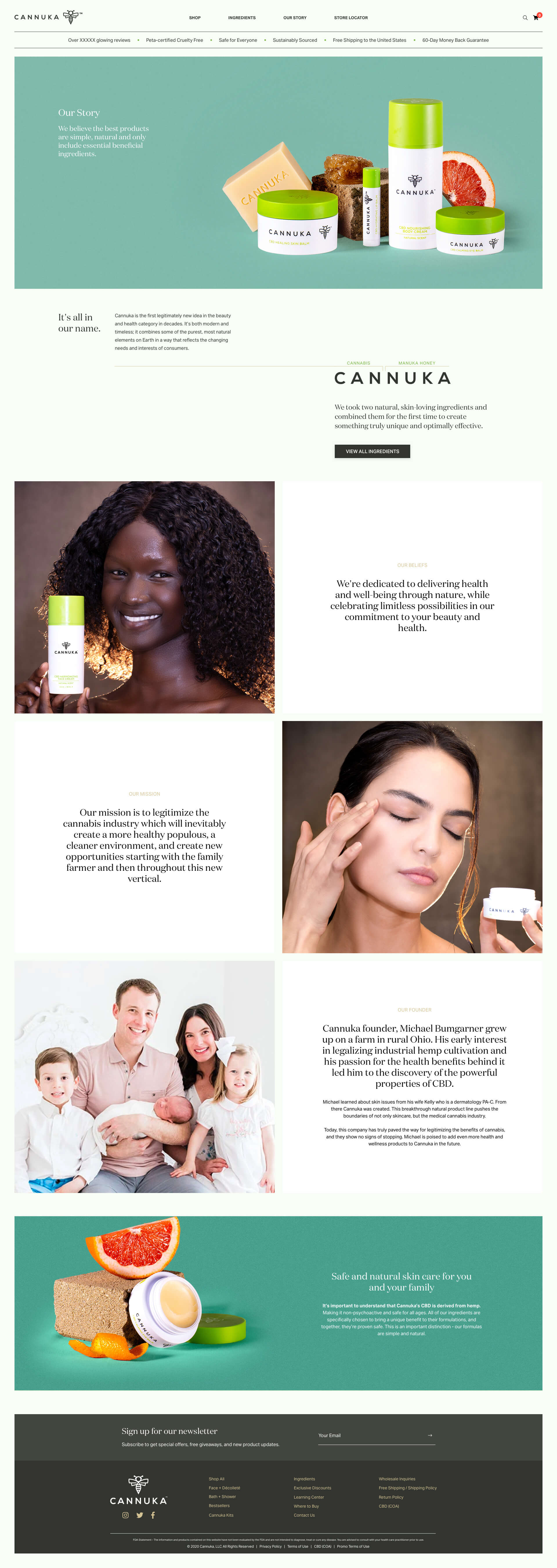
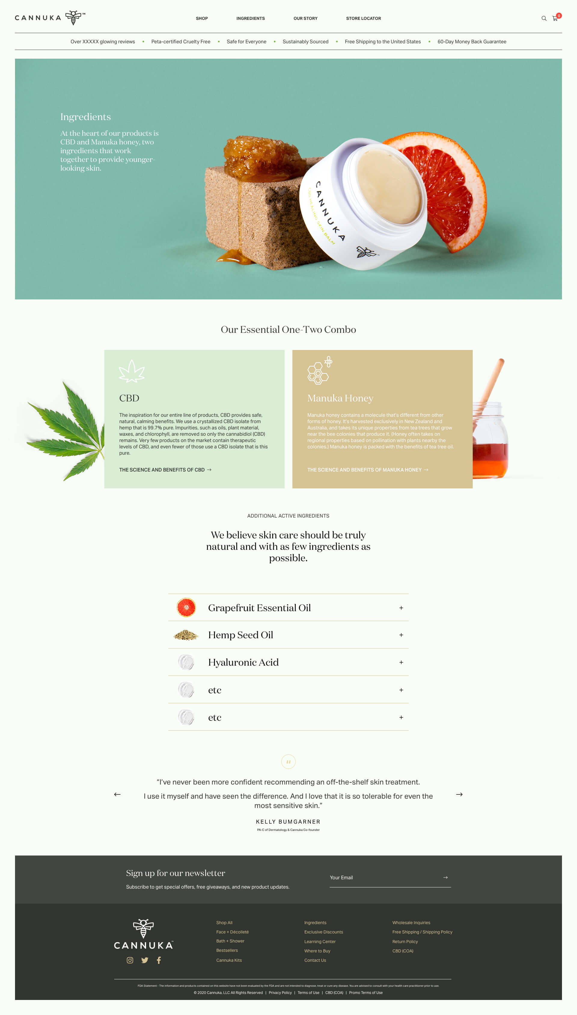
As such I was called upon to redesign their website, imparting a modern and fresh look with the objective to both educate women about how their core ingredients might help improve their skin, as well as positioning key values, such as PETA Cruelty Free, Sustainably Sourcing and Safe & Natural Skincare as pillars to their messaging. In addition, Ten Four curated new photography to help optimally showcase their products while demonstrating brand values.
The new website was launched and immediately saw an increase in conversion.
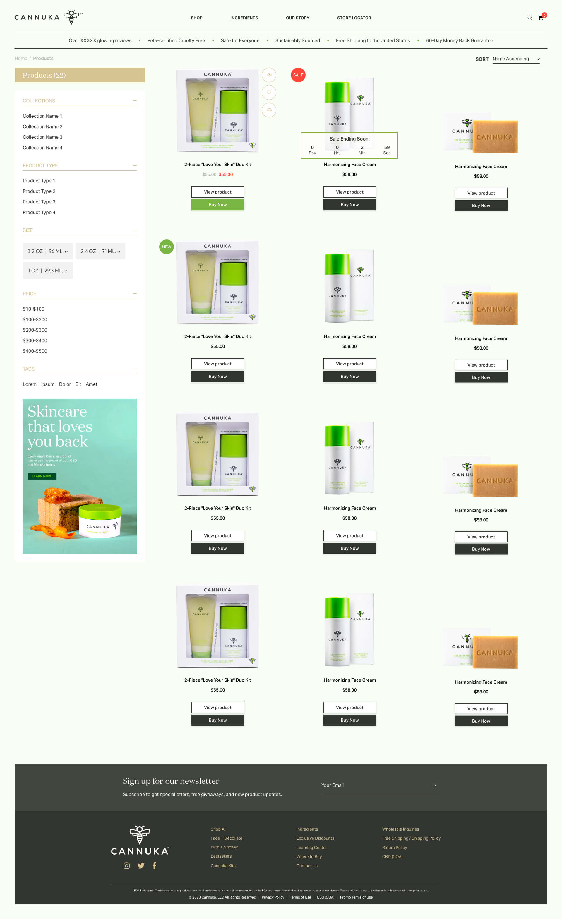
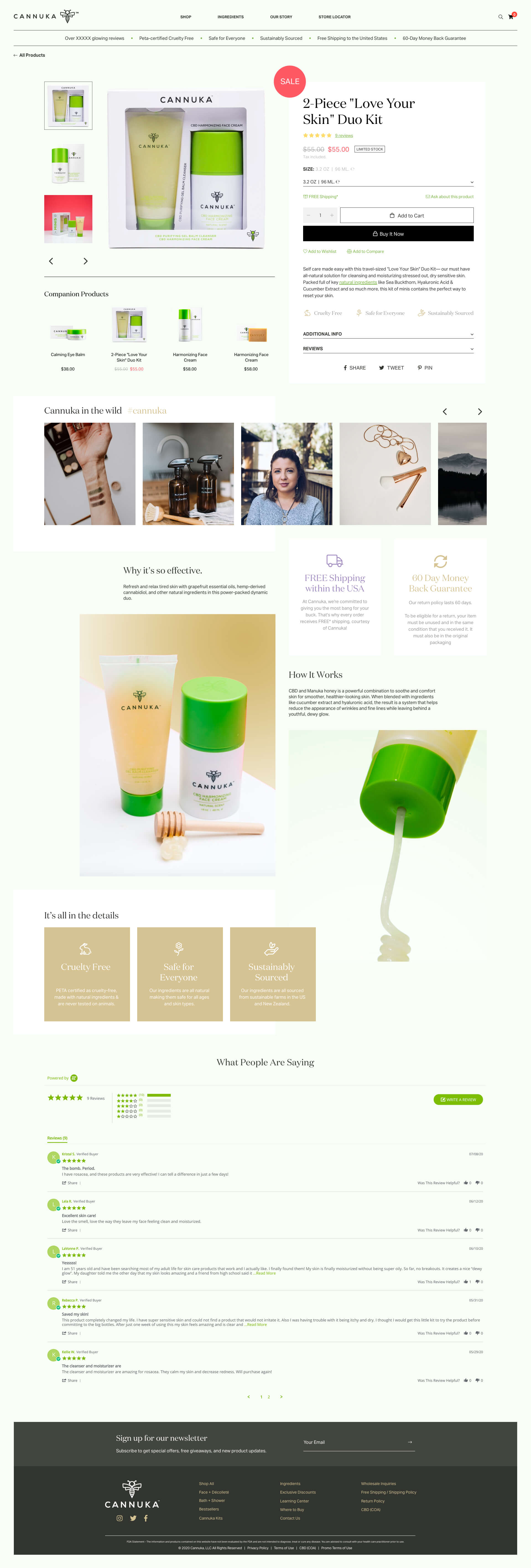
While Cannuka’s website presented quite well, there was still ample opportunity to refine the UX and optimise the site for conversion. In line with this objective I was tasked with enhancing the UI, promoting trust and staying true to the brand while advancing the design, performance, and perception of the site in prospective customer’s eyes.
Employing a 3-piece banner was a considered choice; allowing for a density of material above-the-fold. This treatment firmly establishes the site’s identity and position, while also offering significant real estate for promotions and sales.
As I proceeded with the other components, I deployed the essential ingredients that make a highly-converting site. These include key USPs, one-click purchase, and a swathe of credibility and trust markers (particularly important given the subject matter). But it wasn’t all about ticking boxes. Design-wise I kept things fresh, marrying bold layouts with expert photography, splashing colour in the right places and generally having a good time practicing my craft.
It wouldn’t be performance marketing without line-of-sight on advertising and sales performance.
For this I utilised Google Data Studio, aggregating Google Analytics and Facebook data sources thanks, in part, to a Supermetrics connector.


